Jeff Pawlowski | Presteligence
Introduction
In the world of journalism and publishing, typography plays a crucial role in conveying information effectively. Newspapers, as one of the most traditional forms of print media, need to carefully consider every aspect of their design, including font selection. Choosing the right fonts for newspapers is essential to maintain readability, evoke the appropriate tone, and enhance the overall aesthetic appeal of the publication. In this article, we will explore the key factors to consider when selecting fonts for your publication.
1. Legibility
Legibility is the paramount consideration when choosing fonts. Readers must be able to effortlessly read and comprehend the content. Here are some tips to ensure legibility:
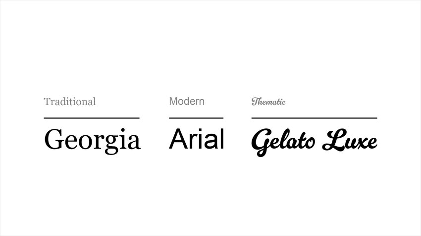
- Serif Fonts: Traditional serif fonts, such as Times New Roman or Georgia, are popular choices for newspapers. The serifs (small decorative strokes at the ends of characters) guide the reader's eye and facilitate smooth reading.
- Font Size: Select an appropriate font size that balances the need for fitting content on a page with ease of reading. Generally, body text should range from 9 to 12 points, with headlines larger for emphasis.
- Line Spacing (Leading): Adequate line spacing prevents lines of text from crowding each other, making it easier for readers to follow the text.
2. Tone and Branding
The choice of fonts also affects the newspaper's image. Different fonts can convey distinct messages:
- Serious and Traditional: For newspapers with a serious and traditional image, fonts like Times New Roman or Garamond work well.
- Modern and Contemporary: If your newspaper aims for a more modern, contemporary feel, consider sans-serif fonts like Helvetica or Arial.
- Thematic Fonts: Occasionally, newspapers may opt for unique fonts that match the theme of a special edition or content piece. This can help evoke a specific mood or atmosphere.
3. Consistency
Maintaining font consistency is essential for the overall cohesiveness of a newspaper. Avoid using too many different fonts within a single issue as it can lead to confusion. Typically, newspapers stick to a small selection of fonts, using them for different purposes like headlines, body text, captions and special features. This consistency creates a unified and professional appearance.
4. Hierarchy
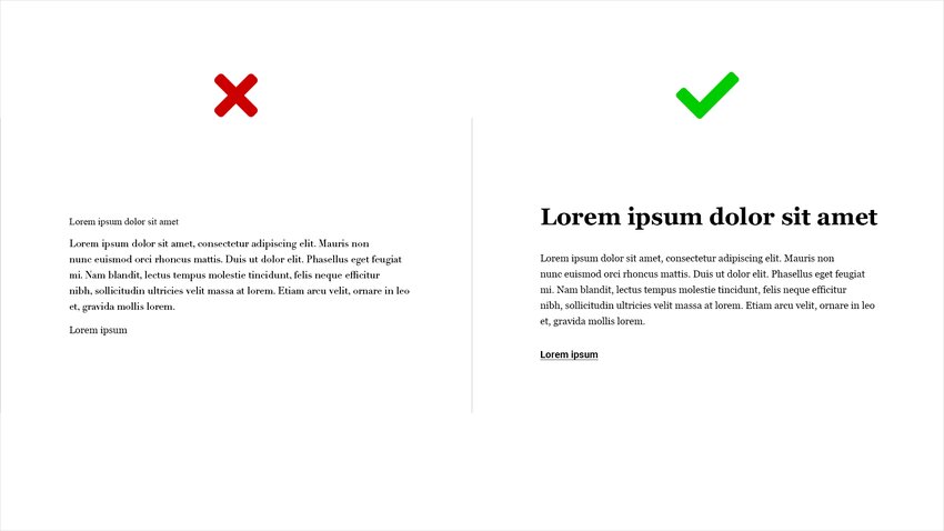
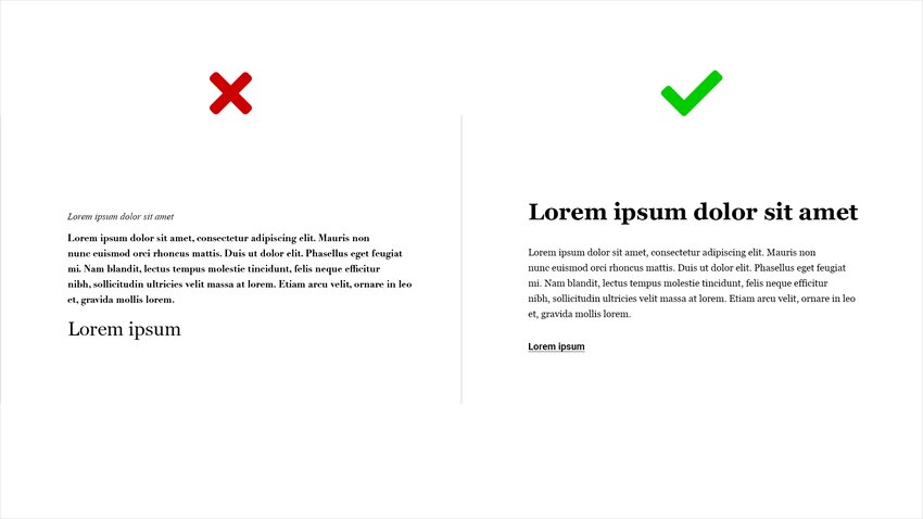
Font hierarchy is the practice of using different fonts and sizes to establish a visual hierarchy in your newspaper's layout. This helps readers identify headlines, subheadings and body text. A clear hierarchy makes the content more scannable and engaging.
5. Digital Adaptability
In today's digital age, newspapers must consider the adaptability of their chosen fonts across various platforms. Ensure that the fonts you select are available in digital formats and can be rendered well on screens, including mobile devices.
6. Accessibility
With an increasing emphasis on accessibility, it's essential to choose fonts that are inclusive. Consider readers with visual impairments and ensure that your chosen fonts are accessible in terms of size, contrast and spacing.
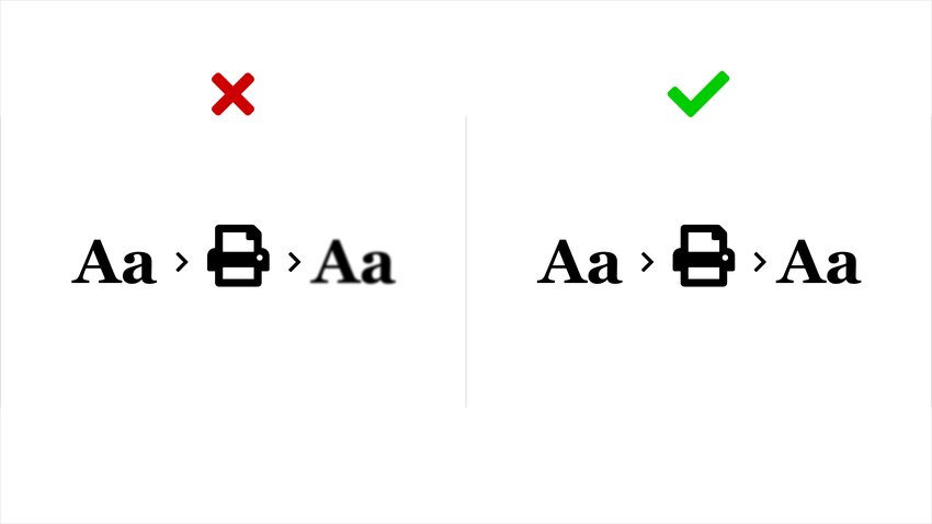
7. Printing Considerations
Print quality can also be influenced by font selection. Some fonts may work better with specific printing methods, so consult with your printing team to ensure the chosen fonts will reproduce well in the final newspaper.
Conclusion
Keep in mind that fonts suggested above are only that, a suggestion. Selecting the right fonts for your publication involves careful consideration of legibility, tone, consistency, hierarchy, adaptability and accessibility. The fonts you choose have a significant impact on how readers perceive your publication. By making informed decisions, you can enhance readability and overall aesthetic appeal, while also maintaining a strong and consistent brand image. Remember, font choices should align with your publication’s unique identity and cater to the needs of your readers.